+7
Suggestion: Date Selector
Here's a minor suggestion that I didn't see. It's not a huge issue but it does add up. When adding projects you need to add start and end dates for each step of the workflows (at least in Smart Projects). You need to click a drop-down menu to add each start and end date. Each one takes a fraction of a second to load, and then it may take time to scroll/click to the date. By having to do this twice, the time adds up.
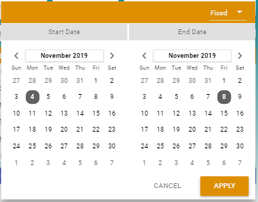
It could be helpful to make the start and end date-selectors be a single dropdown. Here are two examples... The first has two columns, one for the start one for the end. The second allows people to highlight a start and end in a single mouse stroke.


Thoughts?
Customer support service by UserEcho


Anything to reduce unnecessary mouse clicks. Thanks, Mark. You don't tire out ;o)
Sigh... I'm updating some internal documentation so I started clicking around. My pointer finger is tired though. :)
Oh... I forgot... It should be just like it is in the Smart Project date selector. That is a single selector for the start and end dates. That would do it!
Thank you for bringing this up Mark! It would be great if you could move this topic to Product Development Ideas forum even though this is a minor suggestion.
Would love a selector like this! Seems so minor but every time we select dates and times I think it takes a bit longer than it should.